Color Pair Studio
Ship on-brand colors that just work in Light & Dark
Turn any brand hex into native SwiftUI assets that already pass contrast. Paste a hex, verify contrast, and ship a reusable light/dark color asset—without guesswork.

Color Pairs without the hassle
Designers love brand colors. Platforms love system colors. Color Pair Studio reconciles the two—faithfully. Start from a brand hex, get a trustworthy native result that adapts in Light and Dark Mode, passes real contrast checks, and drops into Xcode with autocomplete.
On-brand: stays true to the designer’s hex
Native: looks and feels like Apple intended
Accessible: WCAG-aware with clear pass/fail

Paste a HEX, pick a mode, hit Generate.

Nearest system color + minimal tweaks—no custom palette.
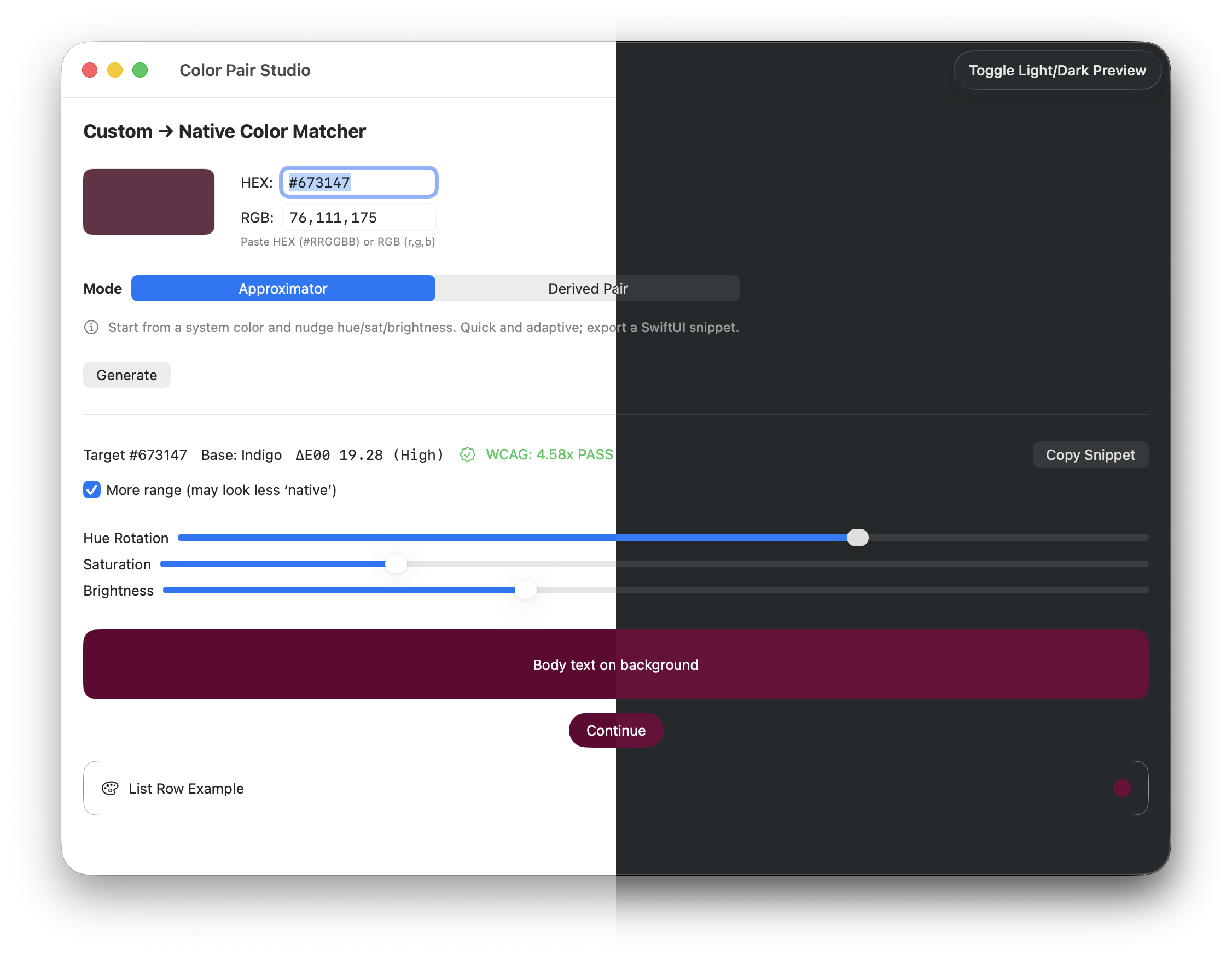
Instant Light/Dark previews for your chosen base.

Copy a ready-to-paste SwiftUI snippet.

Production-safe twins with contrast badges—Both PASS.

Keep Light exactly your brand—when contrast is safe.

Copy Assets + SwiftUI setup in one click.

Click a swatch to copy its #HEX—fast handoff.

Analytics are opt-in. No PII. No color values sent.
Key features
Derived Pair (Pro)
Create a reusable color with Light and Dark twins that read beautifully on their respective backgrounds. Includes a Bias slider to fine-tune brightness balance.
Approximator (Free)
Start from a native base (e.g., .mint, .teal) and dial in modifiers. A More Range toggle gives extra headroom when you need it.
Real accuracy, not vibes
A live ΔE00 (CIEDE2000) difference meter shows how close you are—labeled Very Low / Low / Medium / High. You’ll know when you’ve truly hit it.
Accessibility, built in
Live WCAG contrast badges:
Text: white-on-color AA check for quick UI overlays
BG: color-vs-background legibility target (≈3:1) for platform surfaces
One-tap Fix Contrast nudges brightness to pass without destroying your match.
SwiftUI-ready exports
Copy snippet for quick drop-in usage
Export to Assets (with clear steps) for a single, named color that autocompletes across your app
Native Mac app, the traditional way
On-device processing, no accounts, no servers. Optional, opt-in anonymous analytics (off by default). Keyboard shortcuts (e.g., ⌘L to toggle Light/Dark preview). Feels right at home.
Analytics are opt-in and never include color values. See Privacy Policy.
Who it’s for
iOS & macOS engineers who want to keep brand intent without fighting Dark Mode
Product designers working in SwiftUI who need trustworthy platform results
Indie devs who value clarity, speed, and native quality over heavy tooling
Why it’s better
Trustworthy by design: quantitative color difference + explicit contrast checks
Native first: leans on system behaviors that age well with OS updates
Fast to ship: copy a snippet today; promote to a named asset tomorrow
Privacy-first: your colors never leave your Mac
Pricing (placeholder)
Free — Approximator, live ΔE00, WCAG badges, copy snippet
Pro (in-app upgrade) — Derived Pair generation, per-twin badges, history (coming), quality-of-life extras
(Exact pricing to be announced; join the list for launch discounts.)
FAQ
Does Color Pair Studio send my color data anywhere?
No. All processing is on-device. Analytics are opt-in and anonymous (simple feature counts), and are off by default.
Is this only for SwiftUI?
It’s SwiftUI-first, but the colors you create work anywhere in your project. If you prefer UIColor/NSColor, the same values apply.
How accurate is the match?
We show ΔE00 live. “Very Low” generally means visually indistinguishable in typical UI contexts. When a perfect match would harm readability, we favor accessibility and show you why.
What about contrast?
Badges show both Text (white on color) and BG (color vs platform background). A one-tap Fix Contrast can nudge brightness to meet AA or a 3:1 UI element target.
Will it work offline?
Yes.
macOS version?
macOS 14+ (Apple Silicon recommended). Works with Xcode’s standard asset catalogs.
Are you affiliated with Apple?
No. “Xcode” and “SwiftUI” are Apple trademarks used descriptively.
Technical notes
Export: Copyable SwiftUI snippets and guided Assets setup for a single, named color with Light/Dark variants
Preview: App-level Light/Dark toggle (⌘L), live meters for ΔE00 and contrast
Planned: swatch history, Figma import, auto-tweak suggestions, iCloud sync
Support
Support → support@touchdigitalsoftware.com
Release Notes / Changelog